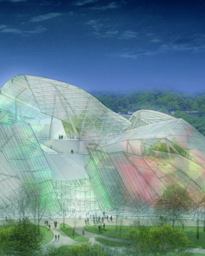
Gehry's Louis Vuitton Foundation for Creation -- a fancy title for what's basically an art museum -- is planned for western Paris. The design is most notable for its lack of resemblance to Gehry's recent buildings, like the Walt Disney Concert Hall or the Millennium Park bandshell. Instead of titanium or stainless steel we see glass, with dashes of color here and there. It's like a deconstructed greenhouse or Crystal Palace, much different than Gehry's other Parisian building, the American Center (now La Cinemathatheque Francaise).
Does this change in material signal a change in Gehry's career? Wines quoted Marcel Duchamp's contention that one must "clean off one's desk" at least three times in one's life. This entails throwing out what came before and basically starting from scratch. Wines did this in his move from art to architecture and then formal architecture to green architecture. Gehry has done this in lesser degrees in the span of his career, from using affordable materials in relatively simple compositions to deconstructed and fragmented designs to curving and complex forms. Here we see a continuation of the complex forms but glass doesn't want to necessarily curve like thin steel, so a different form arises. As Gehry indicated in a press conference for the project, "We'?ve built 30 or 40 models, and the design is still evolving. It's not going to look exactly like this, so forgive me," indicating an attempt to resolve the form with the skin. But if this signals a shift in the career of the 77-year old architect, we'll have to wait and see.

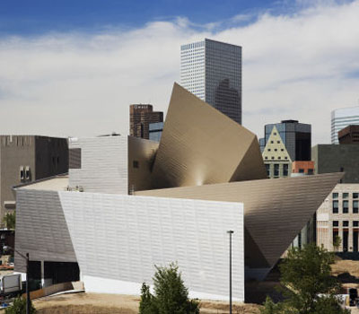
Daniel Libeskind's extension of the Denver Art Museum opens to the public tomorrow, making the controversial project the architect's first completed building in the United States. According to WAN, "Visitors will enter the building through a 120-foot high sky lit atrium that features dramatically sloping walls and a grand stairway that provides access to the galleries. An additional two-story atrium is located in the 17,000 square foot bi-level modern and contemporary galleries."
This -- and most of Libeskind's buildings -- falls into what Wines calls "architecture as sculpture." Influenced by the Russian Constructivist movement of the early 20th-century, this highly formal and structural architecture is anachronistic to Wines, looking for expression in the last century as opposed to the now, where ideas of environmentalism and communication should take precedence over sculptural expression. He also refers to Libeskind's designs as particularly wasteful, requiring extra steel and other materials to achieve the complex forms that don't necessarily have a greater impact than a simpler design might have.

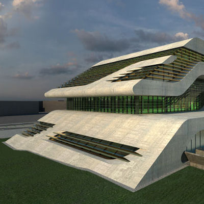
Lastly, Zaha Hadid unveiled her final design for Pierre Vives, "a unique combination of three civic institutions - the archives, the library and the sports department" for the French Department of Herault on the edge of Montpellier, France. What looks relatively sedate or small for Hadid is actually a massive structure with the architect's signature flourishes, such as curving, continuous surfaces and a linear composition (see the image gallery here).
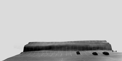
One must wonder where do these forms come from? What is the justification for the continuous surfaces, for example? Wines separates this sort of arbitrary formalism from a conceptual approach that is influenced by its context. This distinction is clearly illustrated by comparing Hadid's design to this unbuilt project from the 1970s by Wines:

Here we appear to see the asphalt parking lot rippling over the building (some sort of big box retail, I think). As Wines said in his lecture this project has more to say about asphalt, parking, and driving (making the visitor or passer-by think about these things in some way) than the building itself, wheras Hadid's design is all about the architecture itself.
While I appreciate the ideas of Wines more than the projects themselves, some application of his ideas to starchitecture, especially in terms of environmental concerns that I really didn't get into here, might help ground their admittedly innovative designs. Designing and building elaborate forms because they can be done (via computers and such) is not a strong justification. If the forms are inflected by concepts taken from their context at all levels (environmental, social, cultural, economical, etc.) they may or may not change dramatically, but they'll have a better chance of saying more over a longer period of time.
0 comments:
Post a Comment