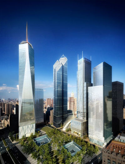
With SOM's Freedom Tower on the far left, the three new designs from left to right are by Norman Foster, Richard Rogers, and Fumihiko Maki. Based on Libeskind's winning masterplan it appears that only Foster stayed true to the sloping top that gestures towards the voids of the Twin Towers and the memorial below. This a bit unfortunate, though Libeskind is quoted in the New York Times (which includes a slide show of the designs) as saying, "The silhouette of the buildings does exactly what the master plan called for." He goes on to say that the buildings should not look the same, something that appears to be the case in their forms but not necessarily their wrappers, where each is some sort of a variation on a glass box, the prevailing trend in just about every tall building these days.
Foster's building, more than fitting the winning masterplan, also -- unlike the others, at least at first glance -- appears to fit its site, at the NE corner of the greater masterplan site. Its sloping, diamond top recalls the Smurfit-Stone Building in Chicago, sited at the NW corner of Millennium Park. Previously the Stone Container Building, it has received much criticism for its stubbiness, flat detailing, and lack of elegance, but its diamond & sloped top acts as a perfect fulcrum from the buildings to the south along Michigan Avenue and the to the east on Randolph Avenue, and vice-versa. Here, Foster's design acts as the corner fulcrum not only horizontally but also vertically, as it sits between the lower Maki and Rogers designs and the tallest by SOM.
0 comments:
Post a Comment