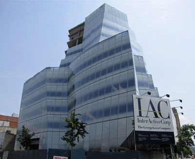
InterActive Corp. HQ by Frank Gehry (image by jschumacher)
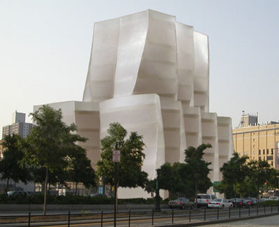
As can be seen from the image below, Gehry's early design didn't really consider the exterior wall as anything more than a formal surface. The gradient pattern on the glass in the construction photo above is nowhere to be seen. The most important things are the building's form (practically unchanged) and that the exterior wall is beyond the floor slabs (meaning curtain wall construction, not the cheaper window wall construction).


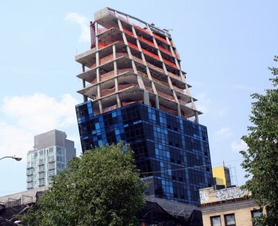
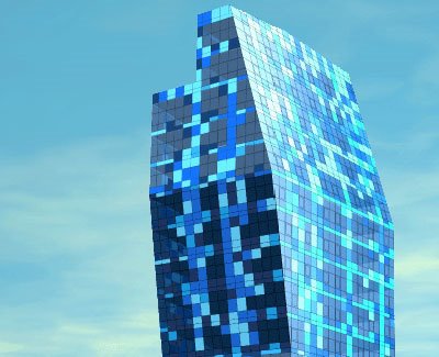
Blue by Bernard Tschumi; image by Test of Will
On the contrary, the before and during on Bernard Tschumi's Blue now rising on the Lower East Side shows that that building is mainly about the exterior wall. The pixelated blues across the facade are carried through verbatim from the rendering through to the fabrication and installation. But like Gehry's building, form is just as important here, with sloping walls most likely responding to the required zoning setbacks.

To me both these buildings are products of an infatuation with celebrity architecture and attention-getting designs. The difference between the two is that Gehry's fame allows him to design something very abstract, dealing with the details later. While Tschumi is a name-brand in architecture circles, for the general public he's just another question mark (for the time being), meaning his design had to be more than just a form with a wrapper; that wrapper had to do something special.
0 comments:
Post a Comment