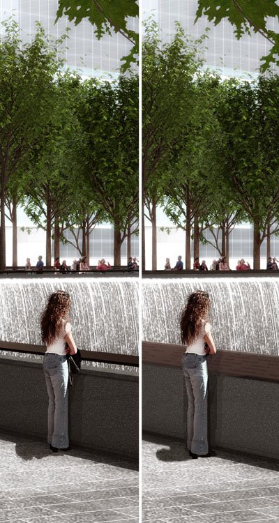
One of the biggest changes to the design is technically one of the smallest. Confused? Take a look at these images:

L-R: Before and After
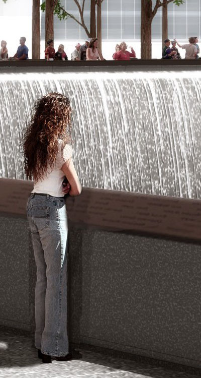
The only apparent change is that the floating handrail has become a solid cap for the parapet wall overlooking the waterfalls and voids below. But if we take a closer look, we see the function of this cap:

Yes, now the names of the dead that were previously etched into the walls below grade, adjacent to the waterfalls, are inscribed into this continuous railing atop the parapet wall. To me this does a few (not good) things: 1. It diminishes the role of the subterranean spaces to a visitor's center, galleries, and places for respite; 2. It diminishes the meaning of presenting the names of the dead via a "two birds with one stone" gesture; and 3. It makes the names an oversight for many visitors who will go to the edge to lean over and look at the waterfalls below (note how they didn't even change the woman in the rendering to reflect the functional change of this piece; she's not looking at the names, but the water below).
Driven mainly by construction exec. Frank Sciame, the full report on the redesign is available in PDF form on LMDC's web page.
0 comments:
Post a Comment